1. Adopt a Mobile-First Approach
Begin your design for small screens first. This forces you to prioritize content and ensures a great user experience on mobile devices before scaling up for larger viewports.
Discover advanced layout strategies that let you build responsive, flexible, and modern web designs. From Flexbox to Grid and beyond, learn how to create dynamic layouts that adapt seamlessly across any device.
Layout techniques in CSS refer to the various methods to arrange and position content on a webpage. Modern CSS offers powerful tools—such as Flexbox and CSS Grid—that enable responsive, flexible, and efficient arrangement of elements.
Here are some of the most popular layout techniques used today:
With devices of all sizes accessing the web, using robust layout techniques is critical for creating responsive designs. They ensure that content is displayed clearly and consistently, regardless of screen size, and allow for engaging, adaptable interfaces.
      /* Flexbox Example */
      .flex-container {
        display: flex;
        flex-wrap: wrap;
        justify-content: space-around;
        gap: 20px;
      }
      .flex-item {
        flex: 1 1 200px;
        background-color: #f2f2f2;
        padding: 10px;
        text-align: center;
      }

      /* Grid Example */
      .grid-container {
        display: grid;
        grid-template-columns: repeat(auto-fit, minmax(200px, 1fr));
        gap: 20px;
      }
      .grid-item {
        background-color: #e6e6e6;
        padding: 10px;
        text-align: center;
      }
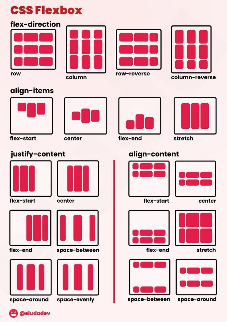
Flexbox is a one-dimensional layout model that helps you arrange elements in a row or column with ease. It greatly simplifies aligning items, distributing space, and building responsive designs.
display: flex; or display: inline-flex;.flex-direction (e.g., row, column).justify-content (e.g., center, space-between).align-items (e.g., center, stretch).flex-wrap).With flexbox, you can easily solve common layout challenges such as vertically centering items, creating equal-width columns without using floats, or reorganizing content order for different screen sizes—all while writing cleaner and more efficient code.
      /* HTML Example */
      <div class="flex-container">
        <div class="flex-item">Item 1</div>
        <div class="flex-item">Item 2</div>
        <div class="flex-item">Item 3</div>
        <div class="flex-item">Item 4</div>
      </div>

      /* CSS Example */
      .flex-container {
        display: flex;
        flex-wrap: wrap;
        justify-content: space-around;
        align-items: center;
        gap: 20px;
        background-color: #f3f3f3;
        padding: 20px;
      }
      .flex-item {
        flex: 1 1 200px;
        background-color: #e0e0e0;
        padding: 15px;
        text-align: center;
        border: 1px solid #ccc;
        border-radius: 4px;
      }
CSS Grid Layout is a powerful two-dimensional layout system that allows designers to create complex and responsive designs with ease. It lets you control rows, columns, and the overall structure, providing precise alignment and distribution of space across a page.
display: grid; establishes a new grid formatting context.gap, row-gap, or column-gap.With CSS Grid, building complex and tailored layouts becomes much simpler. It helps evenly distribute content, creates well-defined structures, and adapts seamlessly to different screen sizes—all while keeping your HTML clean and minimizing the need for extra wrappers.
      /* HTML Example */
      <div class="grid-container">
        <div class="grid-item">Item 1</div>
        <div class="grid-item">Item 2</div>
        <div class="grid-item">Item 3</div>
        <div class="grid-item">Item 4</div>
        <div class="grid-item">Item 5</div>
        <div class="grid-item">Item 6</div>
      </div>

      /* CSS Example */
      .grid-container {
        display: grid;
        grid-template-columns: repeat(auto-fit, minmax(200px, 1fr));
        gap: 20px;
        padding: 20px;
        background-color: #fafafa;
      }

      .grid-item {
        background-color: #e0e0e0;
        border: 1px solid #ccc;
        padding: 20px;
        text-align: center;
        border-radius: 4px;
      }
Multicolumn layout in CSS allows you to divide text content into multiple columns—much like a newspaper or magazine layout.
Using properties like column-count, column-gap, and column-rule enhances readability and creates visually engaging designs.
A multicolumn layout is especially useful for content-rich pages like blogs, news sites, or online magazines. It helps break down large blocks of text into manageable, elegant columns that are easier to read on wide screens, thereby improving the overall user experience.
      /* HTML Example */
      <div class="multicolumn-text">
        <p>Lorem ipsum dolor sit amet, consectetur adipiscing elit. Pellentesque imperdiet, nisi ut luctus blandit, justo leo porta orci,</p>
        <p>Vestibulum ante ipsum primis in faucibus orci luctus et ultrices posuere cubilia Curae; Pellentesque habitant morbi tristique senectus et netus.</p>
        <p>Ut volutpat, quam sit amet tristique tincidunt, ex felis interdum erat, a iaculis est erat quis magna.</p>
      </div>

      /* CSS Example */
      .multicolumn-text {
        column-count: 3;
        column-gap: 30px;
        column-rule: 1px solid #ccc;
        font-size: 1rem;
        line-height: 1.6;
        padding: 20px;
        background-color: #fafafa;
      }
CSS offers different techniques for positioning elements and managing how content flows. In this section, we explore traditional layout methods—CSS positioning and floats—that have been widely used to create dynamic designs. While modern layouts tend to favor Flexbox and Grid, knowing positioning and floats is essential for understanding legacy layouts and for fine-tuning specific behaviors.
The position property determines how an element is placed in the document and how it interacts with other elements. Common positioning values are:
The float property lets you push an element to the left or right, allowing textual content to wrap around it. Floats were once used for complex layouts, but nowadays they are mainly used for wrapping text around images or other content. Remember to clear floats to avoid layout collapse.
      <!-- HTML Example -->
      <div class="container">
        <div class="sidebar">Sidebar Content</div>
        <div class="main-content">Main Content goes here. Lorem ipsum dolor sit amet, consectetur adipiscing elit.</div>
      </div>

      <!-- CSS Example -->
      .container {
        overflow: hidden; /* Clears floats */
        border: 1px solid #ccc;
        padding: 10px;
        background-color: #f9f9f9;
      }

      .sidebar {
        float: left;
        width: 30%;
        background-color: #eef;
        padding: 10px;
        position: relative; /* Example of relative positioning for slight adjustment */
        top: 0;
      }

      .main-content {
        float: right;
        width: 65%;
        background-color: #f0f0f0;
        padding: 10px;
        position: relative;
        left: 0;
      }
Effective layout techniques are essential for creating responsive, engaging designs. By following best practices, you can ensure your layouts are flexible, maintainable, and perform well on any device.
Begin your design for small screens first. This forces you to prioritize content and ensures a great user experience on mobile devices before scaling up for larger viewports.
Embrace Flexbox and CSS Grid to build responsive designs. These systems simplify the alignment and distribution of content and help you avoid cumbersome hacks.
Break your layout into reusable components. Use semantic HTML and clear CSS class naming to create a structure that is easy to maintain and scale.
Ensure that your design meets accessibility standards and performs well across devices. Keep your CSS lean and test your layouts under various conditions.
Use browser developer tools to simulate different environments and actively gather user feedback. Regular testing helps identify and fix issues early.
      /* Global box-sizing reset for predictable layout calculations */
      *,
      *::before,
      *::after {
        box-sizing: border-box;
      }

      /* Base container style for responsive layouts */
      .container {
        max-width: 1200px;
        margin: 0 auto;
        padding: 0 15px;
      }