1. Use Border-Box by Default
Set box-sizing: border-box; globally so that padding and borders are included in an element's total width and height. This simplifies sizing and prevents unexpected layout issues.
The Box Model is the foundation of CSS layout. Understand how margins, borders, padding, and content interact to create structured, predictable designs. Whether you're troubleshooting spacing or building a responsive layout, grasping the box model is essential.
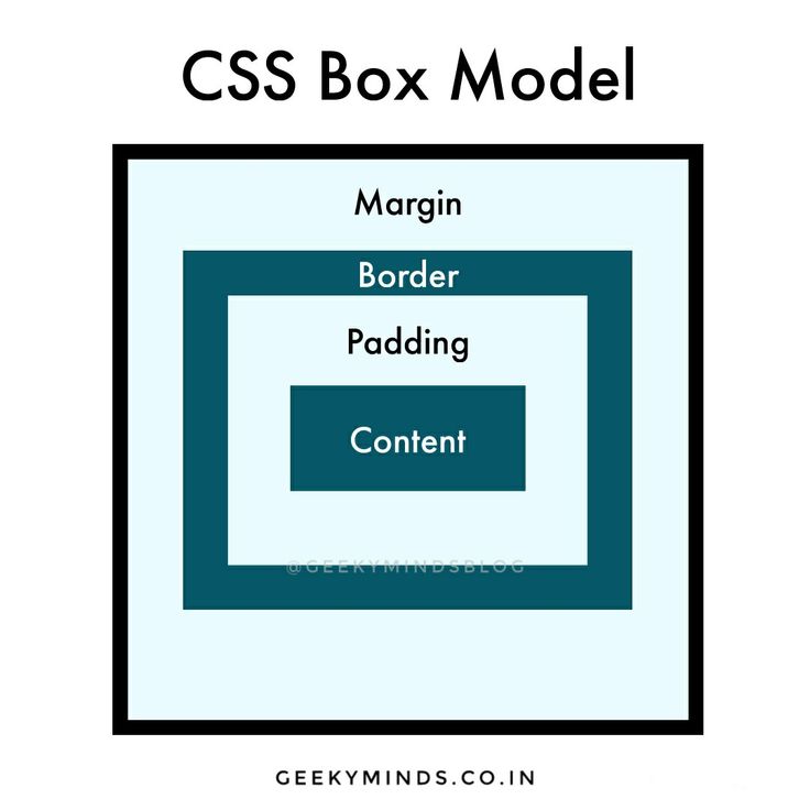
The CSS Box Model is a fundamental concept that determines how elements on a webpage are sized and spaced. Every element is represented as a rectangular box and is comprised of four layers:
Understanding the box model is critical because it:
By mastering the box model, you gain the insight needed to troubleshoot spacing problems and create consistent, flexible designs.
      /* Use border-box sizing for predictable layouts */
      * {
        box-sizing: border-box;
      }

      /* Example element demonstrating the box model */
      .box {
        width: 300px;
        padding: 20px;
        border: 5px solid #333;
        margin: 15px;
        background-color: #f9f9f9;
      }
In web design, content is at the heart of effective communication. Whether it’s text, images, or multimedia, structuring your content semantically and styling it with care can engage visitors and enhance readability.
Web content encompasses all textual, visual, and interactive elements that deliver information to your audience. By using semantic HTML, you ensure that your content is both accessible to users and easily interpreted by search engines.
<h1> to <h6> and <p>.<img> for images and embed video/audio appropriately to complement your text.<blockquote> along with the <cite> element.
      <article class="blog-post">
        <header>
          <h1>The Art of Effective Content</h1>
          <p class="post-meta">By Jane Doe, February 24, 2023</p>
        </header>
        <section class="post-content">
          <p>Creating engaging content starts with clear structure and thoughtful design. Use semantic elements to give meaning and emphasis to your message.</p>
          <h2>Why Content Matters</h2>
          <p>Well-organized content not only improves readability but also helps with SEO and accessibility. It guides your readers naturally through your page.</p>
          <blockquote>
            <p>"Content is the currency of the web."</p>
            <cite>– Web Design Expert</cite>
          </blockquote>
          <ul>
            <li>Engaging headlines</li>
            <li>Informative paragraphs</li>
            <li>Clear calls-to-action</li>
          </ul>
        </section>
        <footer>
          <p>Share your thoughts in the comments below.</p>
        </footer>
      </article>
By following these guidelines and examples, you can create content that is both visually appealing and structured for optimal user experience.
Margin is the outermost layer of the CSS Box Model. It defines the space outside an element’s border, ensuring that there’s breathing room between elements on the page. Proper use of margin is key to achieving well-spaced, visually appealing layouts.
Margin creates space around an element, separating it from adjacent elements. Unlike padding, which is inside the border, margins generate space on the outside. They have no background or content of their own.
      /* Apply a uniform margin to all sides */
      .box {
        width: 300px;
        padding: 20px;
        border: 2px solid #333;
        margin: 15px; /* Applies a 15px margin on all sides */
        background-color: #f9f9f9;
      }

      /* Different margins for each side */
      .another-box {
        width: 300px;
        padding: 20px;
        border: 2px solid #555;
        margin-top: 20px;
        margin-right: 30px;
        margin-bottom: 20px;
        margin-left: 30px;
        background-color: #fff;
      }
The margin property is critical for controlling spacing between elements. It helps avoid congestion, improves readability, and ensures that elements don’t touch each other unexpectedly. Understanding margin collapsing is also crucial when designing vertical rhythms in your layout.
Padding is the space between an element's content and its border. It provides internal spacing that helps keep your content readable and visually appealing.
Padding creates space inside an element, pushing the content away from the border. Unlike margin, which defines space outside the border, padding deals with internal spacing.
box-sizing: border-box;, padding does not add to the total width and height; otherwise, it does.
      /* Uniform padding on all sides */
      .box {
        width: 300px;
        padding: 20px; /* 20px padding on every side */
        border: 2px solid #333;
        background-color: #f9f9f9;
      }

      /* Different padding values for each side */
      .another-box {
        width: 300px;
        padding-top: 20px;
        padding-right: 30px;
        padding-bottom: 20px;
        padding-left: 30px;
        border: 2px solid #555;
        background-color: #fff;
      }
Padding is essential for creating a balanced layout. It provides breathing room for your content, ensuring text and images don't touch the borders directly. This improves readability and enhances the overall aesthetics of your design.
Borders define the visible outline that frames an element's content and padding. They play a crucial role in visually separating and emphasizing elements within your layout.
A border is the line that wraps around the padding and content areas of an element. It can be customized with various properties to adjust its width, style, color, and even its curvature using border-radius.
      /* A simple element with a solid border and rounded corners */
      .box {
        width: 300px;
        padding: 20px;
        border: 3px solid #2c3e50; /* Combines border-width, style, & color */
        border-radius: 8px;         /* Rounds the corners */
        background-color: #f9f9f9;
      }
Borders enhance the visual structure of layouts by clearly demarcating sections. They help separate content, emphasize groupings, and can even be used as design accents. Experimenting with different border properties allows you to create distinctive, professional designs.
Adopting best practices for the CSS Box Model ensures that your layouts are consistent, predictable, and maintainable. Follow these guidelines to avoid common pitfalls and create robust designs.
Set box-sizing: border-box; globally so that padding and borders are included in an element's total width and height. This simplifies sizing and prevents unexpected layout issues.
Use a consistent spacing scale (e.g., multiples of 4 or 8, or relative units like rem) for margins, padding, and borders. Consistency leads to a more harmonious design and easier maintenance.
Vertical margins sometimes collapse when two elements touch. Recognize this behavior and, when needed, use padding or additional spacing techniques to ensure your layout remains consistent.
Apply a CSS reset or normalize stylesheet to reduce inconsistencies across browsers. This step ensures that your box model calculations are based on a consistent foundation.
Because padding and margins contribute to an element's total size, always check your layouts on different devices and screen sizes. Adjust spacing values as needed to maintain a balanced look.
      /* Apply border-box sizing to all elements for predictable layouts */
      *,
      *::before,
      *::after {
        box-sizing: border-box;
      }